Discy.ai
AI-Powered Qualitative Research Platform
Discy AI is an AI platform for user research and product teams that automatically analyses user feedback, interviews, and research data to generate insights. Its core goal is to automate what was once a time-intensive research analysis process.
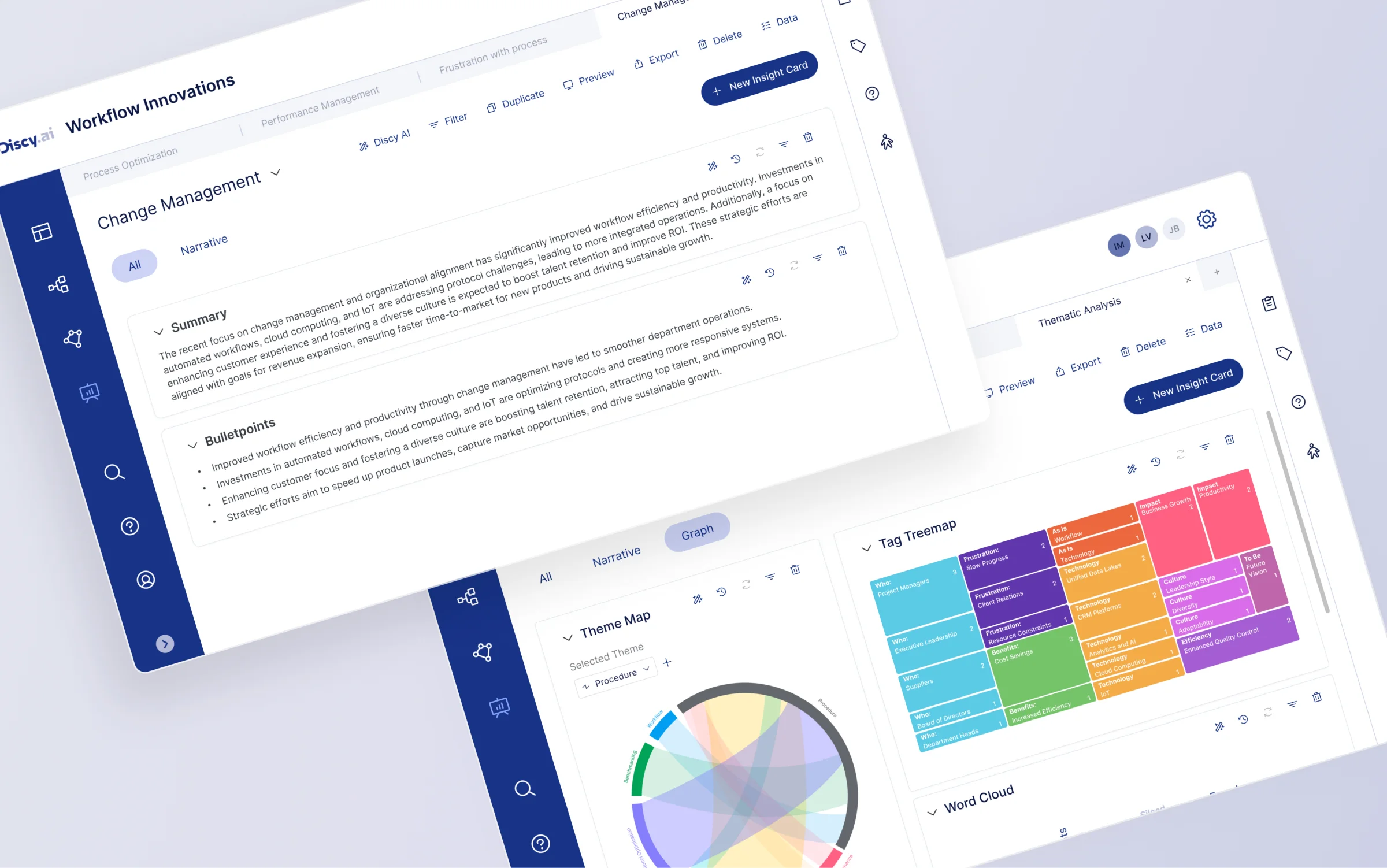
As the UX/UI Designer at Discy.ai, I led the redesign of the flagship Insight Studio. The goal was to evolve Insight Studio from a manual tagging tool into an AI-driven insight workspace - integrating data exploration, narrative generation, and visual analytics into a single unified flow.
Within four weeks of launch, the proportion of users using Insight Studio for analysis increased compared to the previous version.
Post-launch survey showed 82% of users felt the new module improved their research analysis workflow.
AI brought new capabilities, but not better workflows

Users
- Consultants
- Research teams
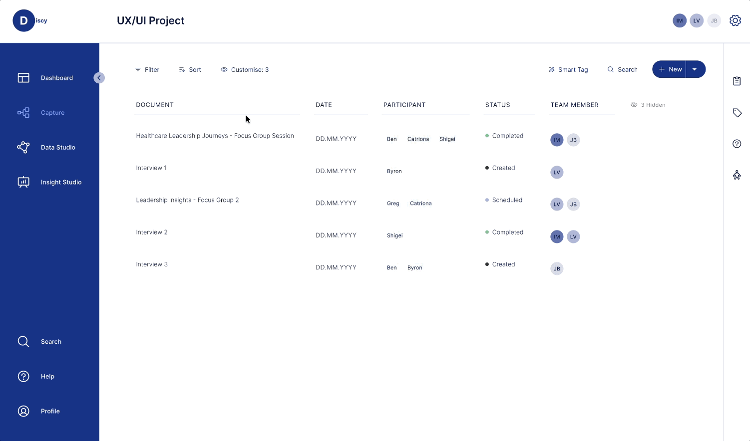
 CAPTURE
 Data Input
- Interview transcripts
- Research notes
- Document reports
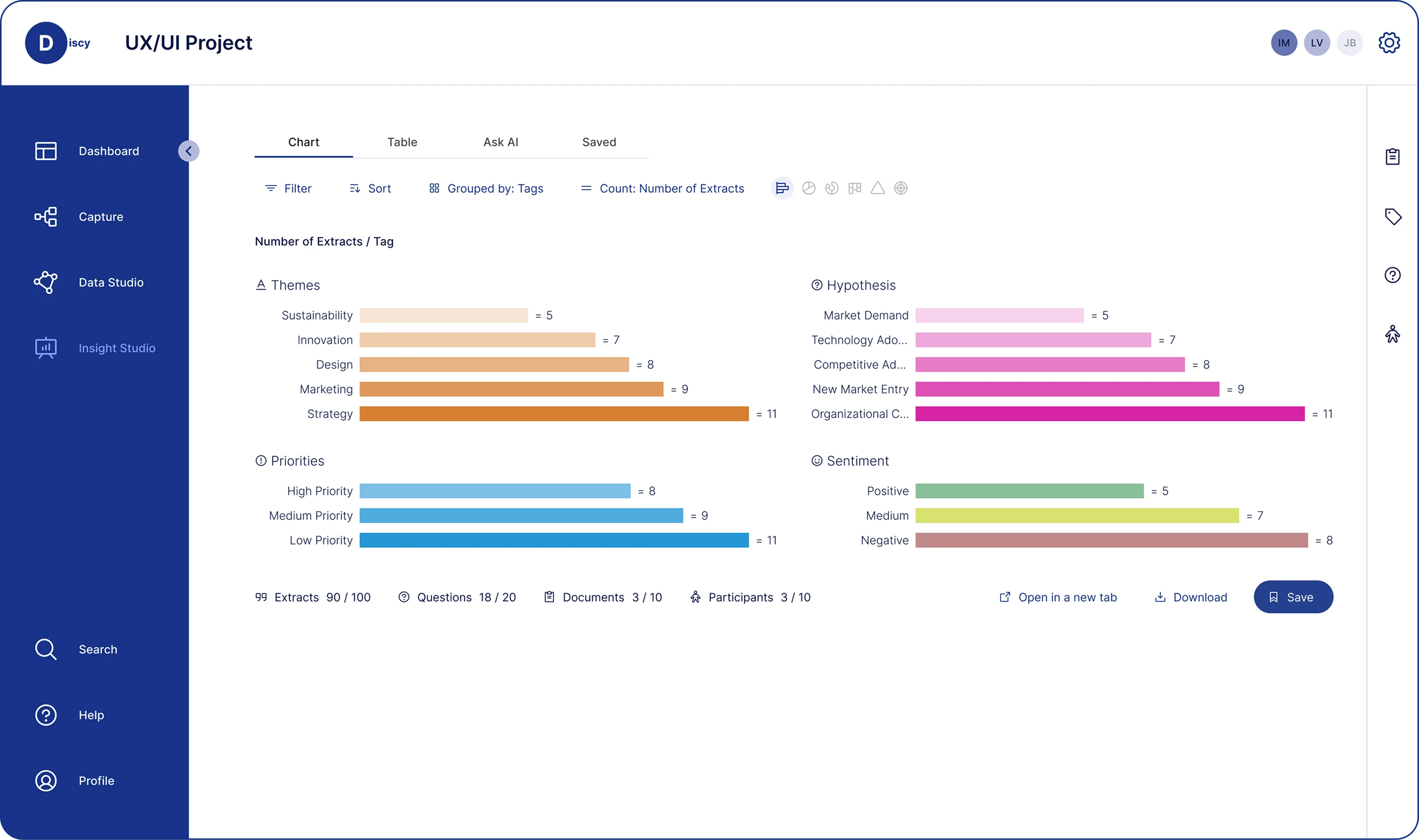
 DATA STUDIO
 Data Organisation & Classification
- Analyse large volumes of qualitative data
- Identify key themes and patterns
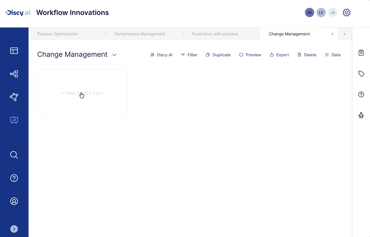
 INSIGHT STUDIO
 Generated Output
- Structured themes
- Visual analytics
- Traceable findings
By mid-2024, SaaS products were rapidly integrating AI - using LLMs to process text, summarise information, and improve productivity. For research and consulting tools, AI was increasingly applied to accelerate qualitative data analysis.
Discy originally helped teams analyse interviews through tags, themes, and visualisations - but the process was still largely manual. As AI matured, the team began experimenting with semantic classifiers, AI summarisation, and chatbots.
Why This Project Started
Product data and internal feedback revealed that Insight Studio's usage rate was low, and the newly added Ask AI had failed to integrate into daily workflows. The project was launched to re-examine Insight Studio's structure and redefine AI's role across the analysis and reporting process.
Understanding the Problem & User Needs
In the early phase of the project, we reviewed the existing Insight Studio design and ran an Empathy Map workshop to map user behaviours and pain points throughout the data analysis process. From these findings, we distilled key insights and user jobs-to-be-done, laying the groundwork for the product strategy and design direction ahead.
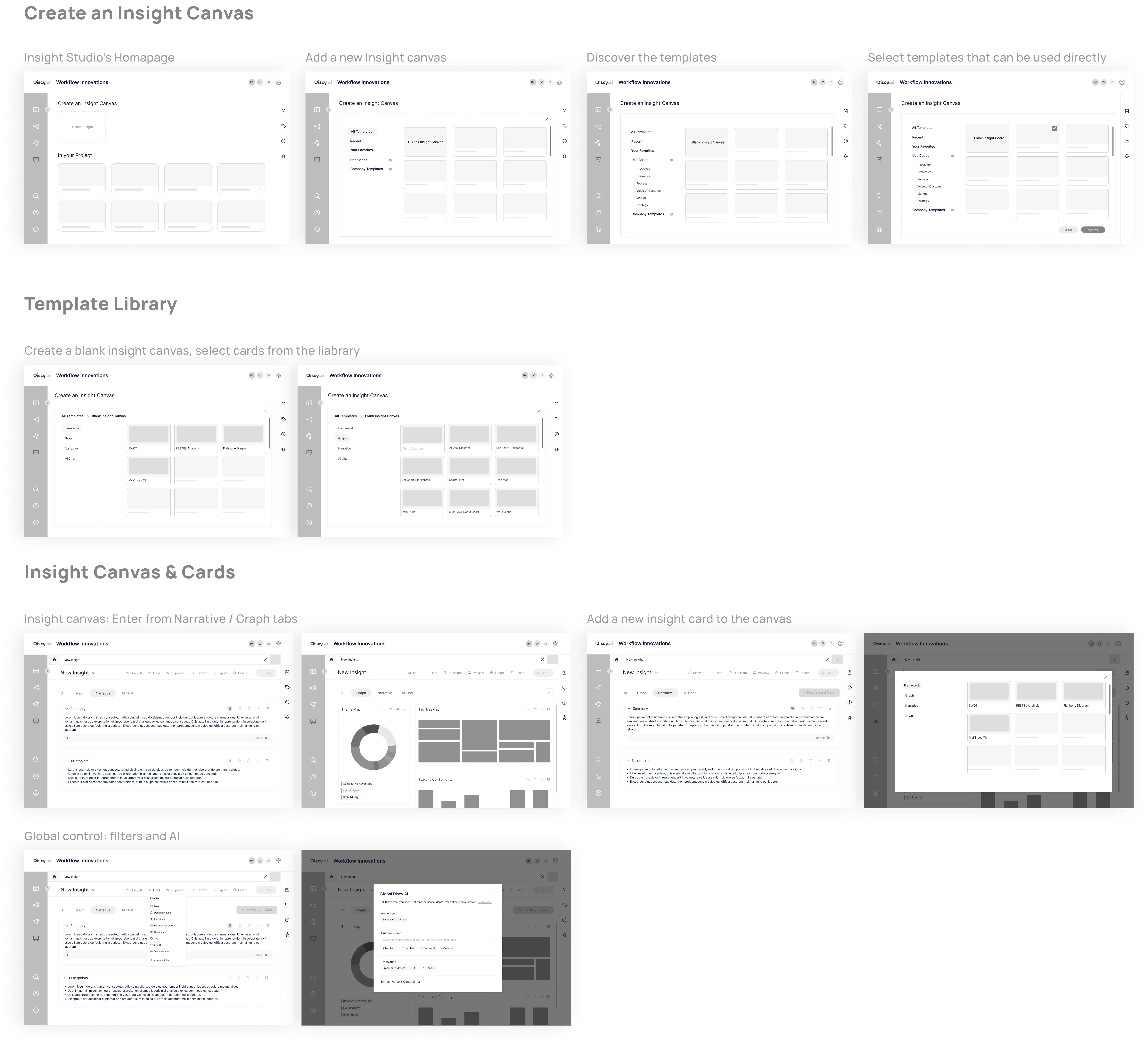
Insight Studio's Original Design
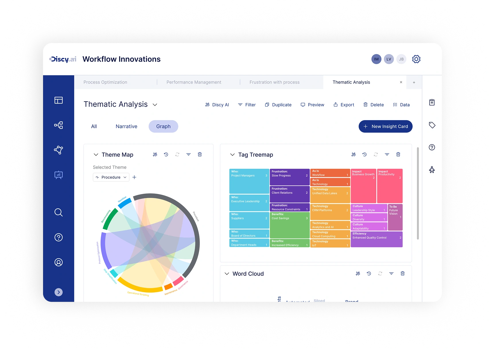
Insight Studio is Discy's core analysis interface for organising research findings and generating insights. The original design split its main functionality across four separate tabs: Chart, Table, Ask AI, and Saved. This structure provided distinct tools for data browsing, table viewing, and AI summarisation - but fragmented the analysis flow across multiple views.
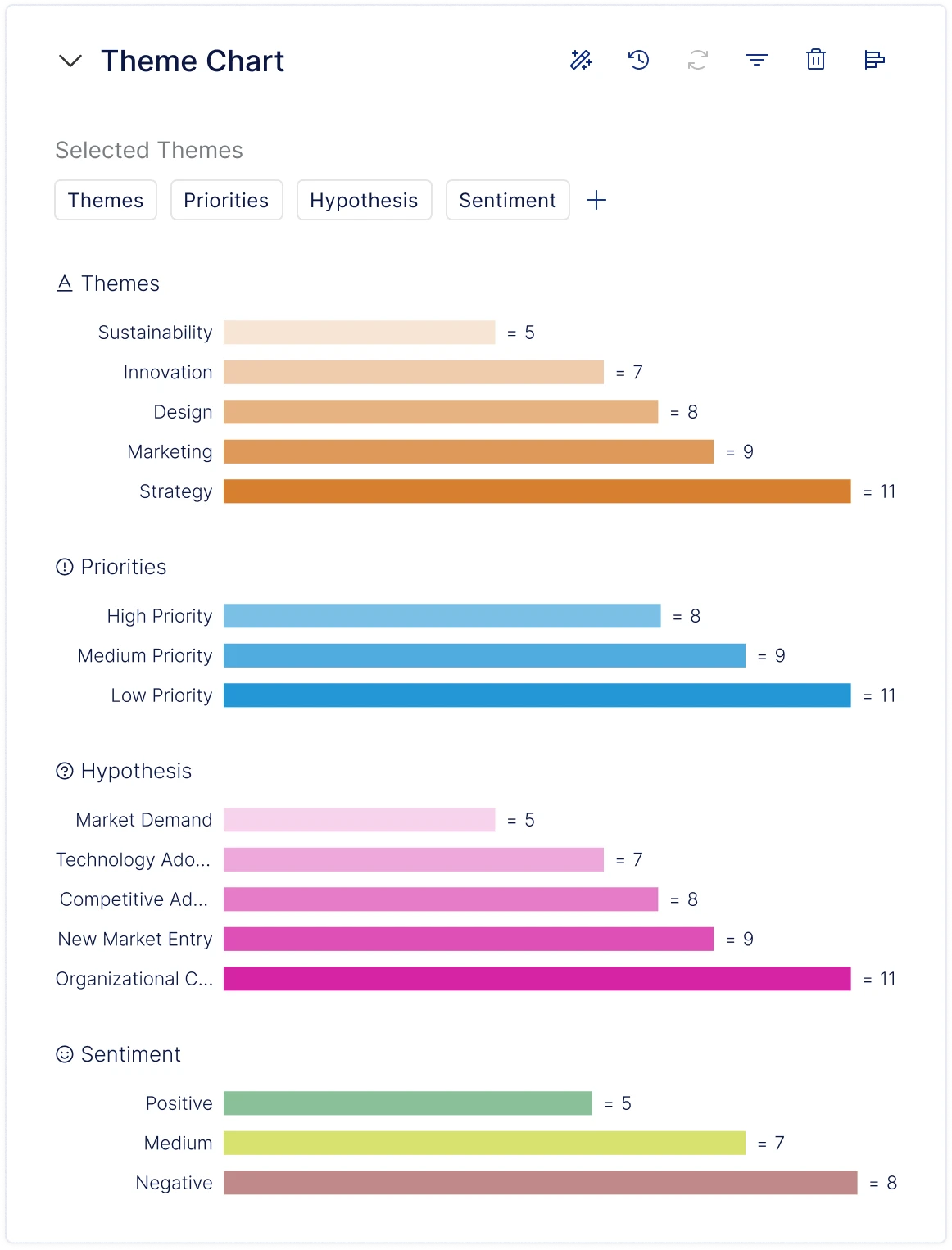
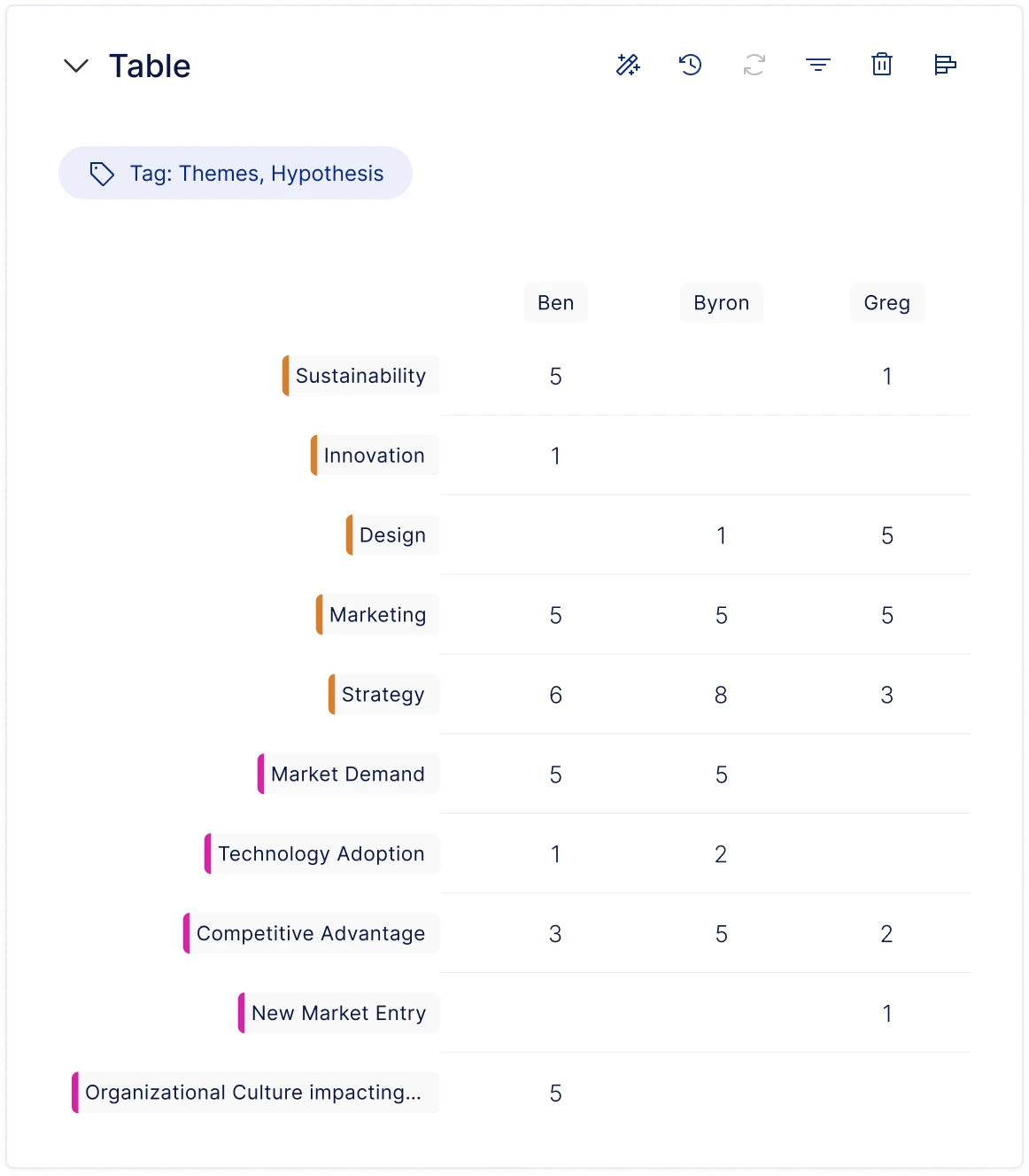
Shows the distribution of a single dimension. Displays tag counts as a bar chart, viewable by user-defined Themes. Supports filtering, sorting, and multiple chart types.
Empathy Map Workshop
To better understand what users actually experienced inside Insight Studio, we ran an Empathy Map workshop with the team. By mapping what users say, think, do, and feel throughout the analysis process, we consolidated existing team knowledge about users and collectively identified the critical issues in the current experience.
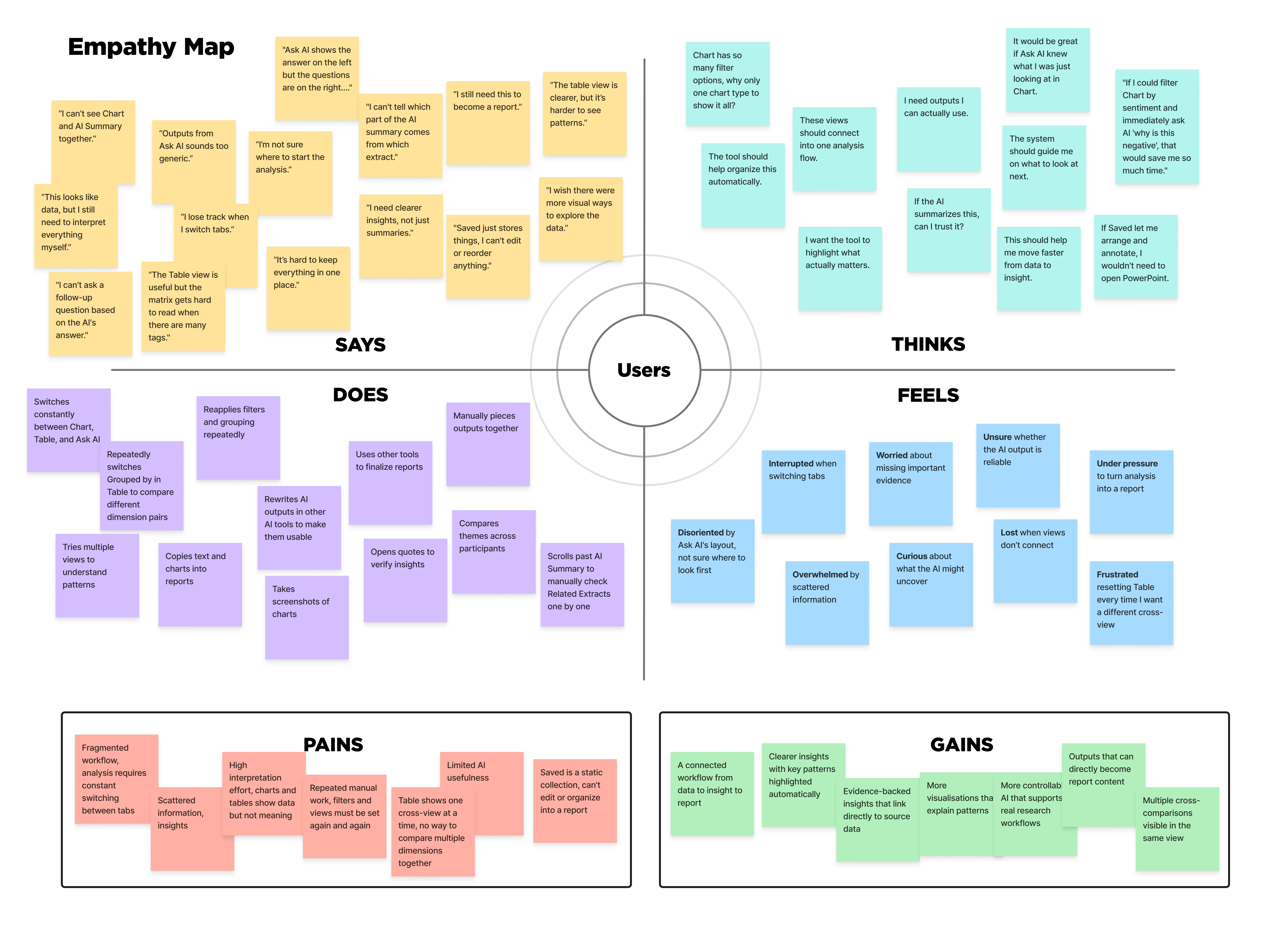
- The analysis flow is fragmented across multiple tabs, making it hard to maintain a continuous line of thinking.
- Limited visualisation types make it difficult to explore data from different angles.
- AI-generated content is too generic, with no clear link back to specific evidence.
- Users must repeatedly filter and regroup data, making the analysis process feel repetitive.
- Cross-dimensional comparison is limited, making it hard to surface connections between data points.
- Users frequently rely on external tools to organise insights and write up reports.
Jobs-to-be-Done
Based on the workshop findings, I grouped the six key findings by user goals, consolidated overlapping needs, and confirmed four core jobs-to-be-done with the team.
Continuous Workflow
I want to explore and make sense of research data within a single, continuous flow - so that I don't constantly lose context during analysis.
Data Exploration & Visualisation
I want the system to offer more varied visualisation options and support simultaneous comparison across multiple dimensions - so that I can explore data from different angles and surface key patterns.
AI-Assisted Insight
I want AI-generated insights to be linked to specific evidence and adjustable through conversation - so that I can validate conclusions and refine my analysis iteratively.
Report Generation & Output
I want analysis results to naturally translate into report content - so that I can move from analysis to output faster.
Competitor Analysis
Looking at competitors, the market already had research repositories, auto-summarisation, and basic AI analysis capabilities - but clear gaps remained in multi-perspective visual exploration and an integrated experience from analysis to output.
| Dovetail | Aurelius | Condens | Loopanel | |
|---|---|---|---|---|
| Positioning | Enterprise customer intelligence - qualitative + multi-source data analysis | UX research repository and comprehensive analysis tool | UX research repository (Insights Magazine) | Recording-centred AI qualitative analysis and repository |
| Workflow Continuity | Can switch between data, Canvas, charts, and insights within a project, but Channels operates independently - no unified view | Follows fixed steps: Notes → Tags → Analysis Board → Report - linear flow with no free navigation | Split-screen lets users read source on the left and write insights on the right; can drag evidence across projects - closest to a unified workspace | Organises analysis around interview guides, grouped by question or tag - good for interview projects but weak support for unstructured data |
| Visual Exploration | Supports Bar / Pie / Treemap / Radar; Canvas supports AI auto-clustering | Bar and pie charts only; Analysis Board provides a kanban-style affinity diagram | Bar and pie charts only; Whiteboard supports manual clustering | No traditional charts; AI auto-clusters themes; data analysis views |
| AI Capabilities | Magic Search summaries include citation links, but users report accuracy issues | AI Assist generates summaries and themes, but no sentence-level citations or source links - traceability relies on manual linking; weakest of the four | AI suggests tags but never auto-applies them; all AI content is editable; every highlight links back to source - explicit human-in-the-loop design | Strongest: AI tags marked with ✦ icon; each note links to transcript position and video clip; AI Summary generates summaries |
| Output Methods | Insights docs support rich text, embedded highlights / video / charts, and fullscreen presentation mode. Export as PDF and JPEG. | Key Insights auto-compile into reports; export as PDF or share link; integrates with Jira and Zapier | Most flexible: Artifact system supports report, persona, and journey map templates; export PDF / PNG / Excel; copy to PPT | Insights Summary panel supports drag-and-drop reordering, but formal reports require external tools |
| Product Screenshots |  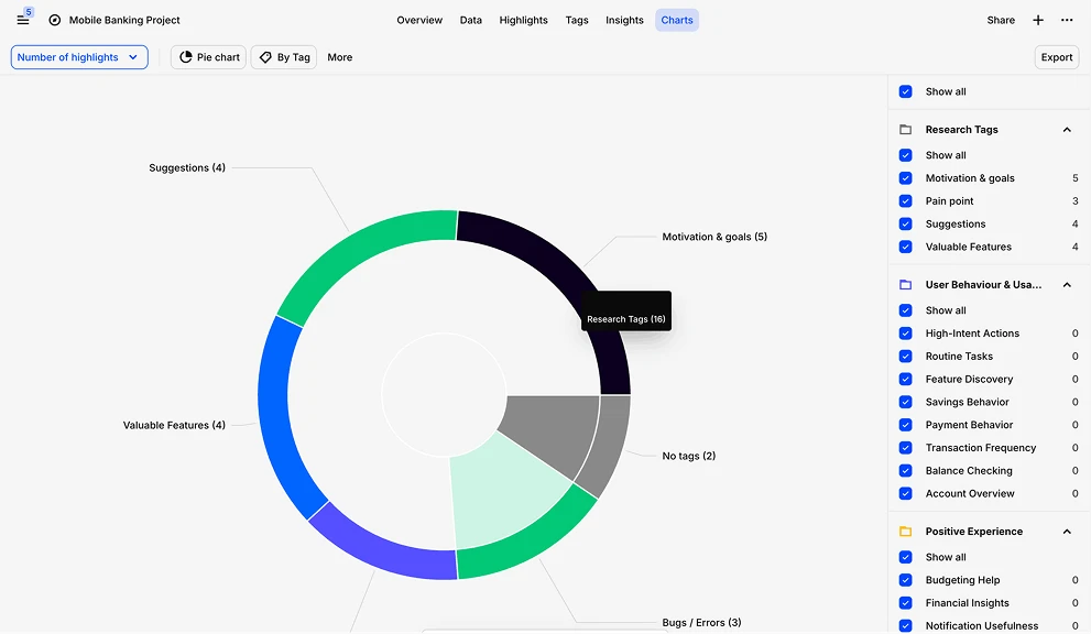 |  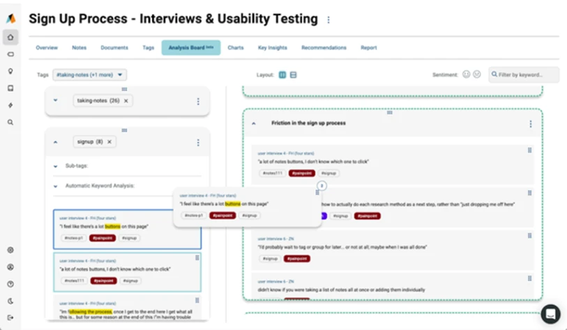 | 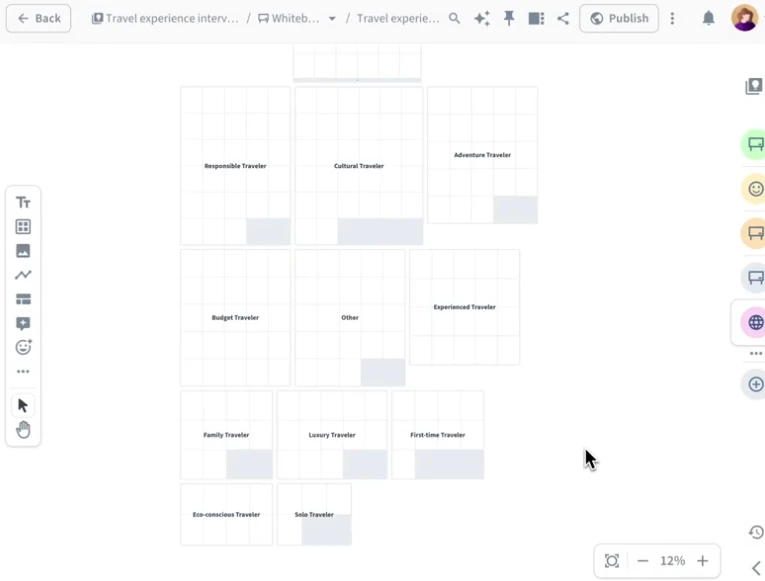 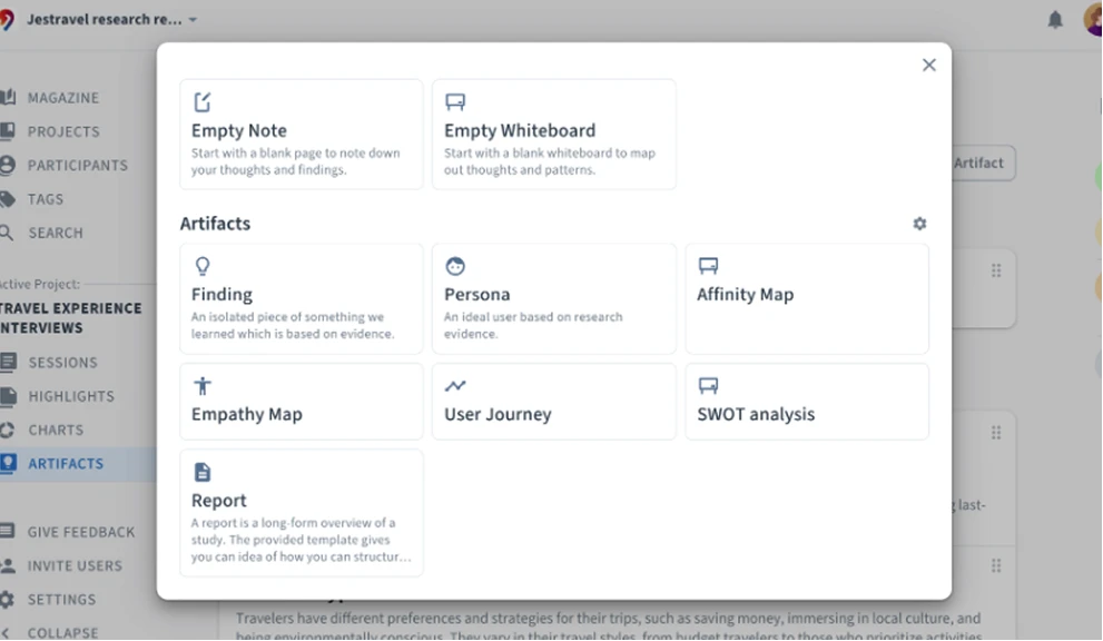 | 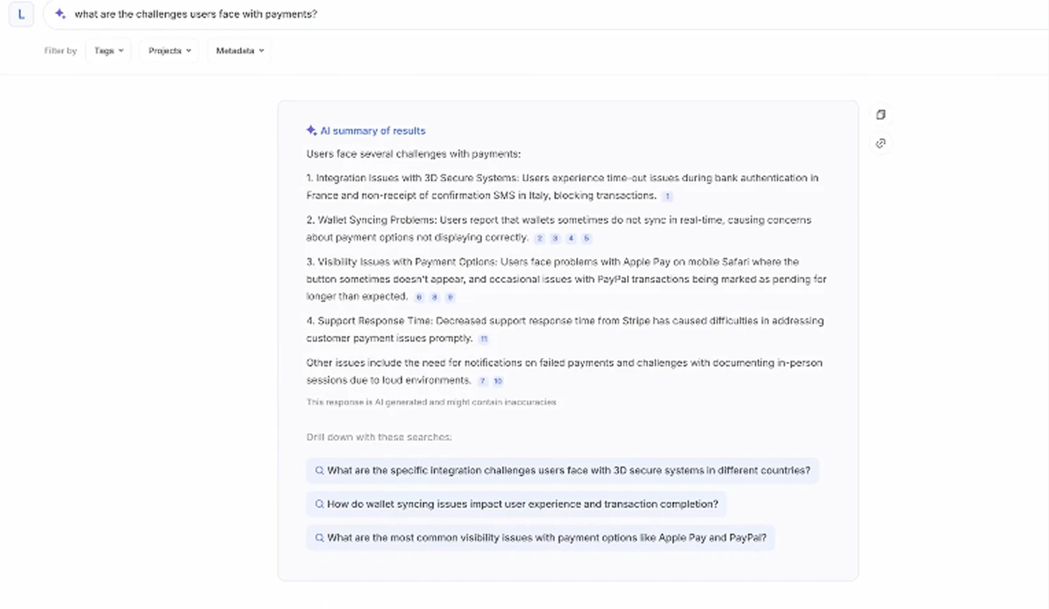 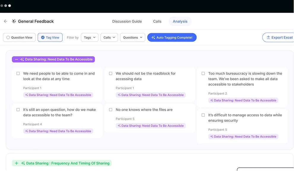 |
Competitor analysis table
The market already had research repositories, AI summarisation, and basic visualisation. Some approaches were worth learning from - Condens' template system for quick analysis start, Aurelius' Analysis Board for draggable affinity clustering, and Loopanel's AI notes linking back to video clips. However, clear gaps remained in multi-perspective data exploration, traceable AI insights, and a coherent end-to-end experience from analysis to report output.
Design Opportunities
From these insights, we defined four key product tactics to improve the overall experience in Insight Studio - from data exploration through insight generation to report output.
Product Tactic
Build a continuous analysis workflow that reduces context-switching between different tools and views
Product Tactic
Provide richer, more customisable data visualisations to help users explore patterns from multiple dimensions simultaneously
Product Tactic
Link AI-generated insights to specific evidence and support conversational refinement
Product Tactic
Enable analysis results to convert directly into deliverable report content, shortening the path from insight to output
Goal
Enable users to complete the full journey from data exploration to insight output within Insight Studio - reducing reliance on external tools.
Exploring Design Directions
Clustering & Idea Generation
The design team and founders ran a Crazy 8 session grounded in the design opportunities and competitive analysis from the previous phase, rapidly exploring different product directions for Insight Studio. After ideation, we voted to surface the most promising concepts and carried them forward into visual design and hypothesis validation.
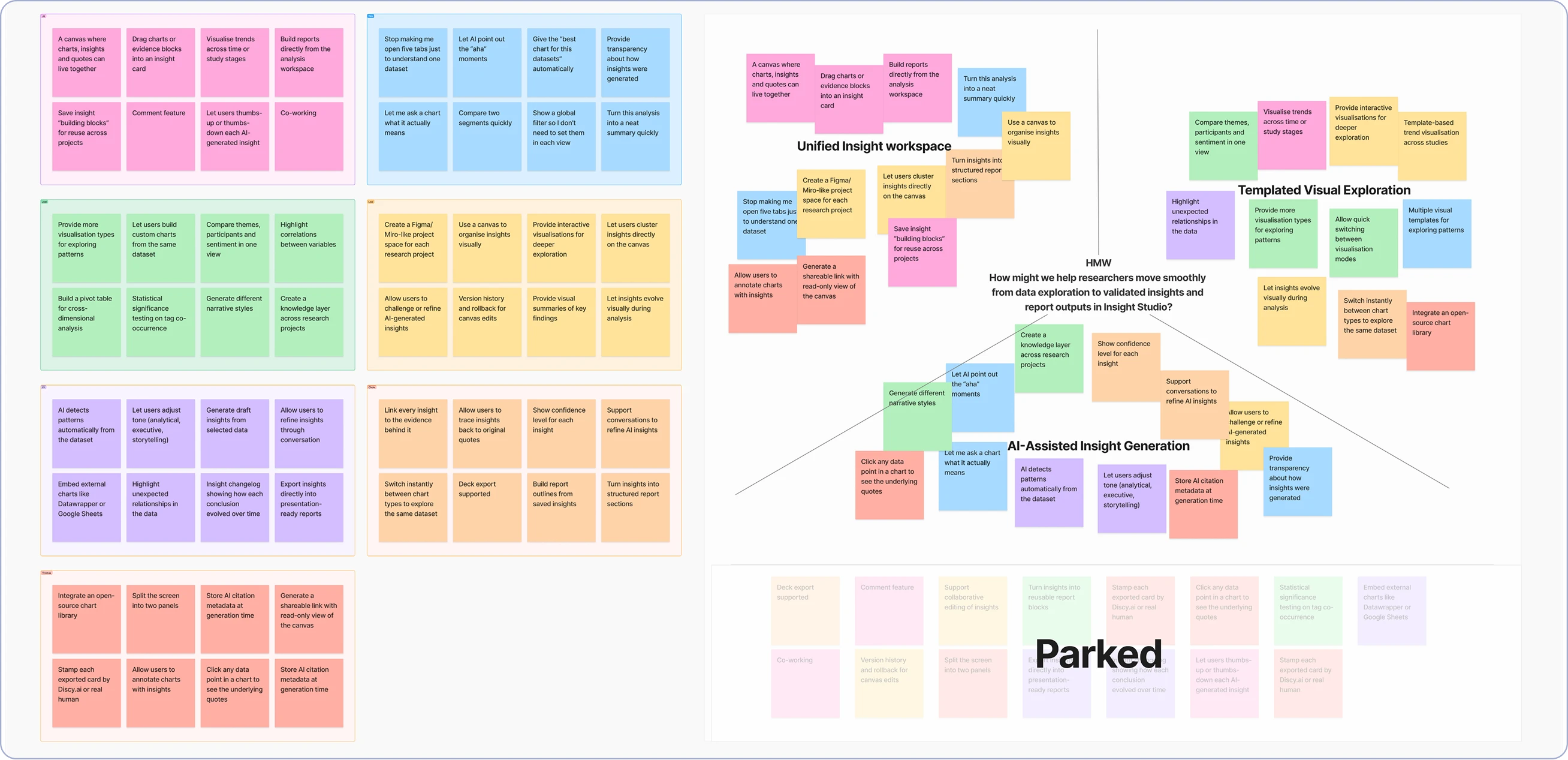
1Canvas-based Insight Workspace
Addressing Tactics 1 & 4 - a unified canvas as the analysis space where charts, insights, and citations coexist in one view, supporting a complete flow from analysis to report output.
2Template-driven Analysis Interface
Addressing Tactic 2 - pre-configured analysis cards and a variety of visualisation types as the entry point, helping users quickly explore data patterns from different dimensions.
3AI-assisted Narrative
Addressing Tactic 3 - AI helps generate insight content, supports conversational follow-up and refinement, and links generated results back to specific evidence sources.
*The session also produced ideas that were valuable but out of scope - including real-time collaborative editing, cross-project knowledge bases, and version history (marked as Parked in the diagram). These were logged into the backlog for future iterations.
UI Development
With the design opportunities defined, I explored interface structures across three different analysis workflows: blank-canvas exploration, templated analysis panels, and AI-assisted insight narratives - rapidly sketching multiple UI variants around each concept.
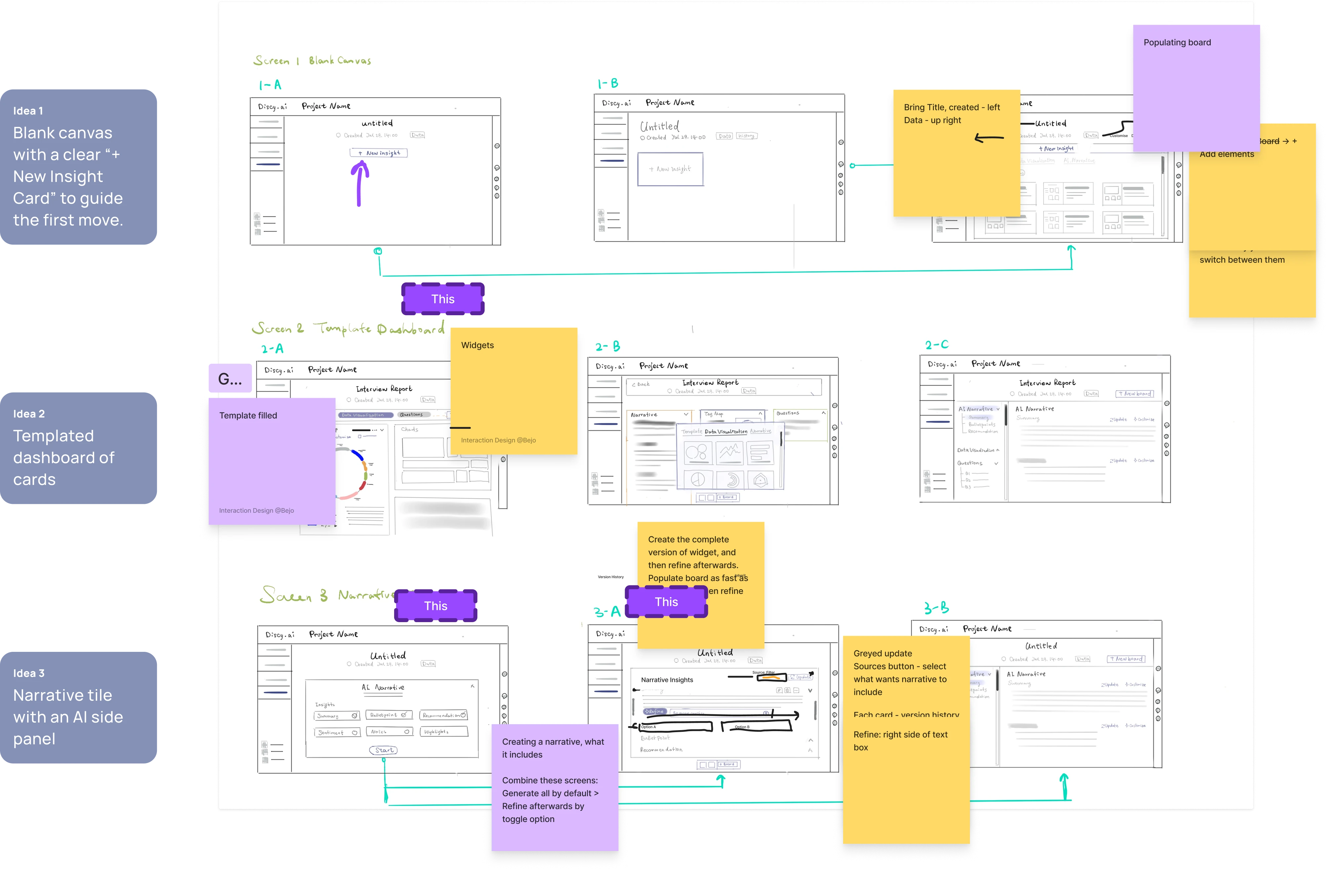
 Hi-fi
Hi-fi 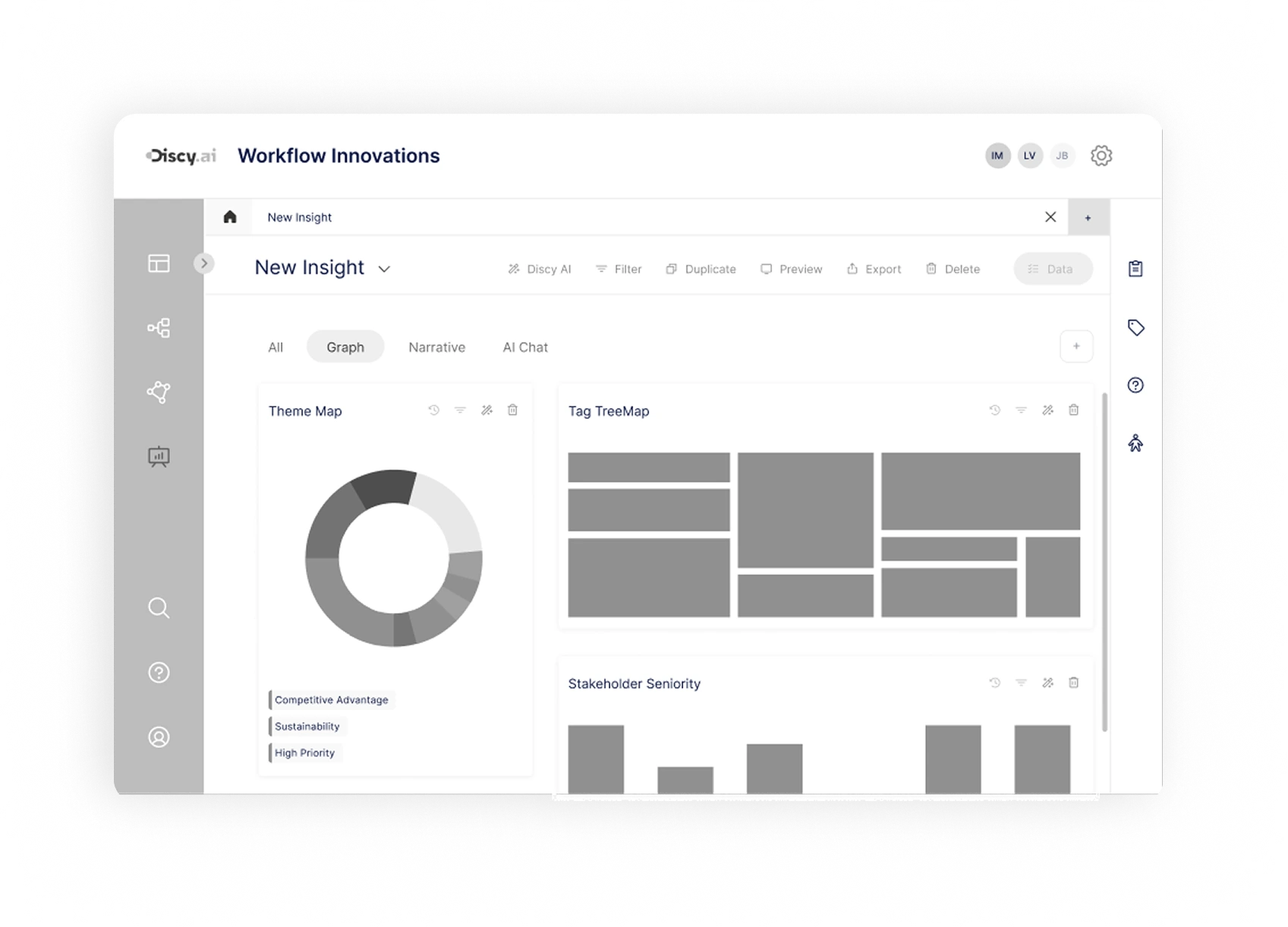 Mid-fi
 A Template & AI-Powered Insight Workspace
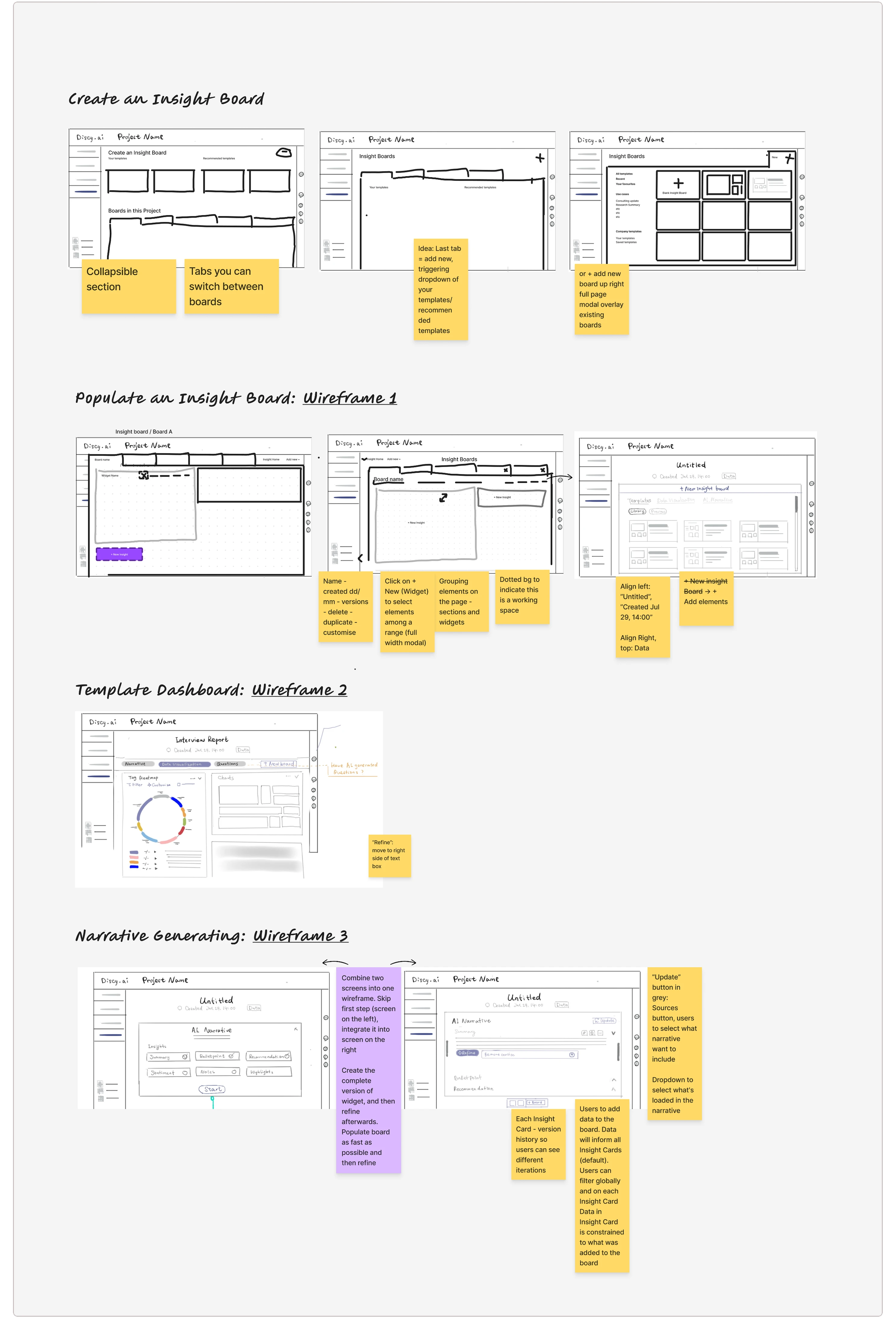
Canvas-based Insight Workspace
- Centralised management: Manage multiple reports or analysis canvases within a single project space.
- Multi-tab & comparison: Switch between and compare different views or canvases.
- Templates / continuation: Start from a canvas template or pick up where a previous project left off.
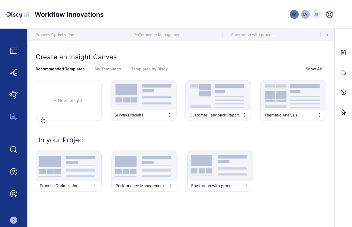
Templated Analysis Cards
- Card-based building: Drag modular analysis cards onto the canvas to progressively build an analysis structure.
- Rich analysis formats: Choose from a component library of different formats (narrative / chart).
AI-Assisted Narrative Workspace
- Instant generation: Generate summaries and key points directly within the canvas.
- Reuse & refinement: Use preset prompts to generate quickly, then regenerate by tone or focus as needed.
Concept Validation & Iteration
Guided Prototype Testing
After locking in the core concepts for Insight Studio, I wanted to validate a critical question: could users understand and accept this analysis workflow built around a canvas, templated analysis cards, and AI-assisted narrative? Together with another designer, we ran guided prototype testing with 18 users, combined with think-aloud observation to see how participants made sense of and navigated the prototype.
Participants completed the following key steps in sequence:
- Create a new Insight Canvas
- Browse and select a template
- Add graph / narrative cards
- Try the AI generation feature
We paid close attention to:
- Whether users understood the purpose and value of the canvas
- Whether templates helped them start analysis quickly
- Whether the organisation of graph / narrative cards felt clear
- Whether AI's role throughout the flow felt natural and comprehensible
Test Results
79% of participants quickly grasped the purpose of the Canvas analysis workspace
Most users were able to understand its structure once they entered the canvas.
65% of participants liked being able to flexibly combine graph and narrative cards
Showing both graph and narrative together was seen as helpful for connecting data to insights.
42% of participants wanted more chart and structure types in the template library
That said, 68% of participants found templates helpful for providing a clear starting point.
57% of participants felt AI should do more than just generate summaries
They wanted AI to: let them ask questions about the data in a chat-like way; generate insights from those questions; and allow continued editing and iteration.
Improvements
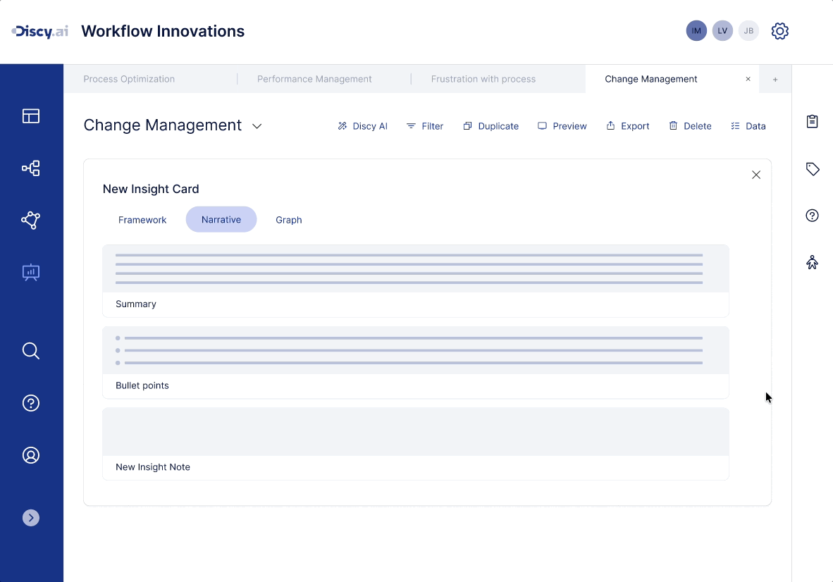
From fixed-structure summary input to AI-interactive Insight Notes
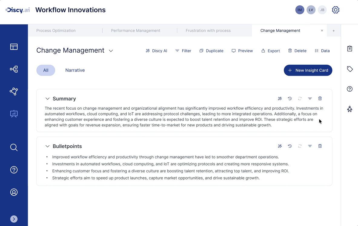
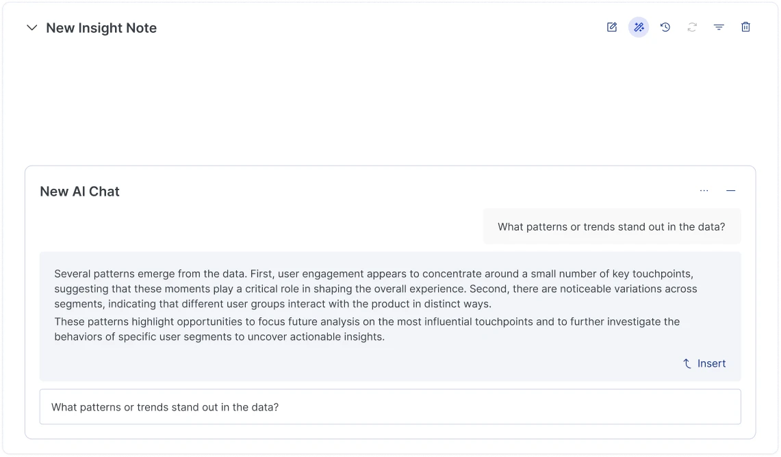
In the original design, Narrative cards were built around two fixed structures - Summary and Bullet points - with AI mainly used to generate that content. The improved design expands Narrative cards into AI-interactive Insight Notes. Users can ask data questions as if talking to an assistant, and AI generates analysis suggestions grounded in the current canvas charts and context. Generated content can be edited, followed up on, or inserted directly - progressively building out a complete insight.
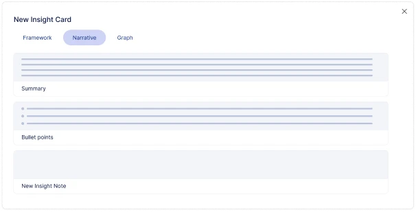
- Create Insight Note: Select New Insight Note from the analysis card library and add it to the canvas.
- Ask questions and explore insights: Ask data questions in natural language directly within the card - AI generates insights based on the current analysis context.
- Refine and insert insights: Generated content can be further edited, followed up on, or inserted directly into insight cards to progressively build a complete analysis conclusion.
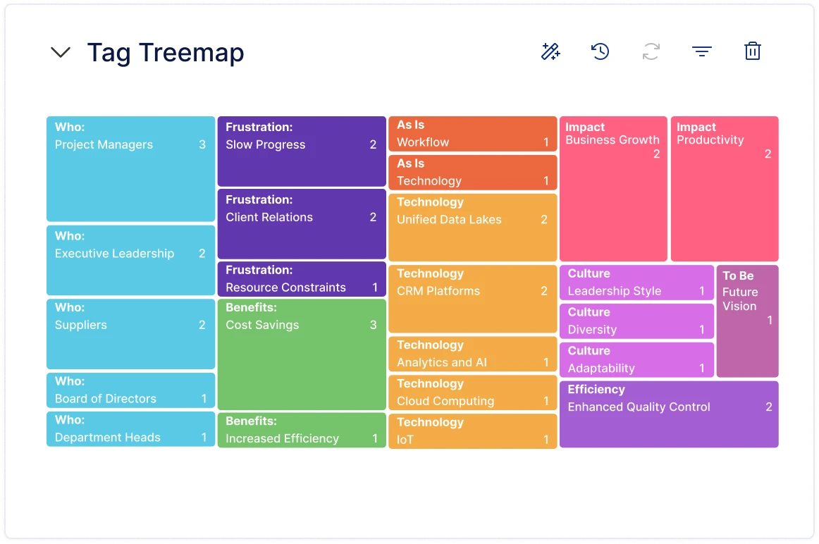
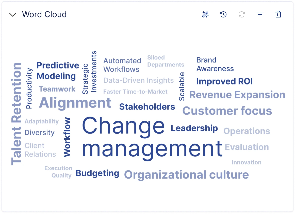
Expanded Visualisation Charts
Based on user feedback, I added a set of general-purpose chart and structure types to the template library - including Treemap, Word Cloud, Bar Chart, and Table.
Results
Insight Studio was completed through design and Figma prototyping, and shipped as a working product. The new workspace integrated canvas-based analysis, templated charts, and AI-assisted insight generation - enabling teams to organise data, generate insights, and produce reports all within the same space. After launch, the team saw a measurable improvement in analysis and reporting efficiency, while the video demo and prototype helped secure more internal buy-in and drive new client pilots.
- Fast traction: The demo unlocked 3 new pilot opportunities and became a centrepiece of the pitch.
- Real adoption: Weekly active users up +34%.
- User feedback: Post-launch email survey showed 82% of users felt the new module improved their insight workflow.

Have a nice project?
Hi, my name is . You can answer me on this email . I am looking for help with a .
Scan on another device